As Georgia State University seeks to serve a globally diverse student population, it is important to tailor academic offerings to meet the demands of the international student body. In particular, language and culture specific offerings are an excellent way to both welcome incoming students, as well as provide a forum for existing students to maintain cultural ties.
In order to begin to develop such a program, the university would first have to determine the major student populations. Given limited resources, it would be important to also measure the percentage a specific student population composes of the entire international student community.
Using a Google API, you can graphically illustrate the composition of the international student body. You can break out the population geographically (by continent, country, or major cities) or by language (Spanish, Russian, Cantonese, or Hindi). In this hypothetical scenario, we will illustrate the five leading countries from which international students originate.
http://chart.apis.google.com/chart?chs=700x280&chd=t:15,20,25,30,30&cht=p3&chtt=Student%20Profile&chl=France|Germany|Brazil|China|India&chco=FF0000,00FF00,0000FF,800080,FFFF00
The pie chart is much more representative of the student population than would be the case with a line or bar chart. By representing each given student demographic as a portion of the pie chart, the viewer can instantly understand the ratio of the given population, as it relates to the entire international student body. By extension, the pie chart can also serve to illustrate a “benchmark” for resource allocation, to ensure funds are spent in proportion to the given student population demographic.
A line chart would be more effective for illustrating trends in student population over a specified period of time. This would allow the viewer to see growth patterns, and potentially anticipate future student needs. Additionally, using a line chart, or a bar chart, would give the viewer the opportunity to graphically illustrate growth in comparison to spending. Ultimately, the selection of chart type is largely driven by intended purpose. The pie chart was selected to represent student demographics a point in time, whereas the line/bar chart would be more effective to show trends.
Sunday, October 25, 2009
CIS 8020 Assignment 2 SR International Student Population
CIS 8020 Assignment 2 JM Google Calendar

Wednesday, October 21, 2009
I can be a pessimist #3
Keeping today's short.
There is a difference between xhtml syntax, and xhtml being served as xml.
To be honest, 80% of developers don't need to know the difference, but probably 80% of those that do need to know the difference don't know the difference.
But if you have kept up with standards talk, xHTML 2.0 has been killed. Does that mean that xHTML is dead? No. The syntax of xhtml lives on as HTML 5.
I'm not the best person to describe what happened, but someone who is good at writing comics is...
Here is the first part of the comic, please click it to go to Smashing Magazine to read the rest of it.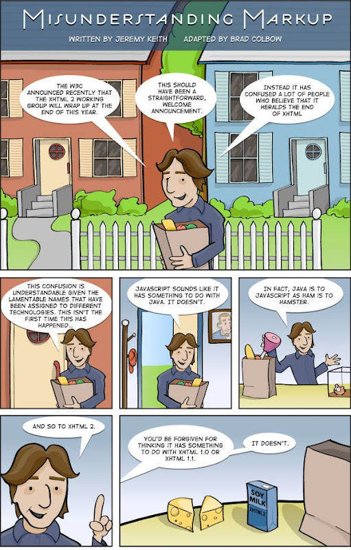
Continue to rest of comic
Tuesday, October 20, 2009
The importance of data and information - a credit bureau love story

CIS 8020 Assignment 2 [PC] [Twitter check]
Scenario:
A company wants to monitor trends of their brand on the internet. To do so, they monitor Twitter for words, and will keep records of what words are being used in tweets that are referencing their brand. Over time, they will be able to see a rough map of what words were associated with the brand over time.
How:
They will do this by using Google Chart's API with data coming from Twitter's API.
Implementation:
Words used in tweets for:
Explanation:
- Uses Google's AJAX Libraries API to load the Prototype javascript framework from google's massive content delivery network.
- Uses Prototype to load the twitter search API. The format requested to the RESTful API is JSON, so it is automatically evaluated as a javascript data structure.
- Uses the porter stemming algorithm (ported to javascript) to get the root of each word, compare them to other words, and keep tallies of how often each root word is used.
- Uses Google Charts API to display data.
- Specifically designed to be one file.
Note:
Only tested in firefox 3.5 on Ubuntu (shiretoko)
It is possible that this will not work in other browsers, as this requires a form of Cross Site Scripting, which has only been recently re-enabled on the web.
Original Source: http://dl.getdropbox.com/u/1078297/mashup.html
Friday, October 16, 2009
Tuesday, October 13, 2009
I can be a pessimist #2

I don't do proprietary
I hadn't used Windows in 5 months... but the streak was stopped the the use of espn 360 to watch college football
I hope I never hear another person tell me that Access is better for data insertion
I think its funny that the presenter said "A code." He can one day be
I think there is a difference between an Internal vs External API
I think that wikipedia still is not a credible source...
I have a hard time seeing cloud computing being any service... the definition given is far too loose. On the other hand, I can see that a person's definition of the term depends on what part of the technical vs business spectrum a person is in. I'm on the more technical side, so cloud computing means something specific.
With that:
-I think being able to use stuff in your car is not cloud computing (it could be, but it isn't in itself)
-Classic Email is not suddenly cloud computing
-Google docs, although is built upon cloud computing, isn't itsself cloud computing.
-Computing in general is not cloud computing, there is a resource consumption that brings about it... it is not just because you don't know what is happening in the background, its a specific computing problem. It is possible to describe the cloud without just describing the basic definition of what the internet is.
I think the NYT PDF conversion thing is an incredible exmaple of good usage of cloud computing: Computing power that you didn't have before, and only need in a short burst of processing power (and don't need to buy a full server for it). With that its great to be at a point where we don't have to worry about creating the most efficient algorithms, when you can just create an instant work force.
I think RESTful design is awesome. In short: it is because it allows you to reuse a ton of code in an MVC pattern for web developlement. In long: look at my commen ton the CIS Integratem blog
I had a hard time, at first, thinking of using Google charts and instantly calling it a mashup. Well, I still do, but I can kinda understand... well not really... But atleast I can see how one could call it that... well not really. However I do see how mashup has become a buzzword... and therefore its meaning has dropped =\

